Blog Archive

03/04/2017

Brand & Packaging Project

Last Brief of the Year and I had to decide what I'm planning to design and produce. I thought a very long time about it (comparing to my class mates) . But finally I have decided that I am going to design something to do with packaging and the label brand. But then there was a problem what I can design and reproduce in a packing and brand.  One of my colleagues from work said " What don't you do something  of your own heritage- something that you won't see in a British retail industry". After that  I immiedly thought about what's my heritage. It's easy to say I'm Polish , but it's harder to think what Poland is famous for.... 

Doing a lot of research of my OWN country, I was also talking with my friends and family. I'm not trying to say that everybody does consume some sort of alcohol in Poland but vast majority of Polish population does it every weekend after hard week at work. Even my British friends agreed with me with my opinion about the alcohol consumption by Poles. I thought maybe I should do a Vodka brand and packaging ?! 

I have done something similar few years ago while I was studying at College. At the time I was doing Graphic Design too, therefore it is easier for me right now to explore and research bit more about the actual topic than when I had to do it for the first time as a unexperienced "Graphic Designer" 

In my opinion Brand and Packaging project will show all my best abilities and skills that I have reached and learned throughout all these years in College and at University. But this time I will be gathering all of my past research and of course brand new researches to explore more and more about the brand I would want to design and the packaging I'm going to produce. I'm going to use multi research such as Books, journals, the actual examples of packaging ( Vodka packaging and labels from shops). I'm also going to try reach to some of the British Vodka brand's industries, to also explore and get to know the British spirit market. It will be easier then to compare them two industries and point out the differences between them too. 

The key things I'm going to look at while researching about the topic: 
  • What's the actual branding and packing about ? 
  • Examples of Vodka spirits and their packaging, (from books, shops, journals and web) 
  • History of Polish Spirits and brands 
  • Talk about the meanings of some Polish alcohol brands. 
  • Explore brainstorm about everything that may be related to the project. 
  • How I can explore my ideas 
 To be continued...

22/12/2016

Christian Louboutin

High Fashion Footwear 

Today I'd like to talk about another research about my packaging brief I was given. But today I will mention high fashion high heels, that I guess every girl and woman would like to own now a days. Of course I will be mentioning their packaging designs and what impact it may have on creating some designs for high fashion packaging. I already have some ideas of designs and what I eventually I would like to produce as a high fashion shoe packaging, but I will talk about it after I present my research.
Okey, so let's talk about very first high heels and its packaging that came up to my mind. 

Christian Louboutine: 

Born in France in 1963 Christian Loubtine first started dreaming up fantastical footwear in his early teens. He was expelled from school at age 16 and started working for famed shoe designer Charles Jourdan two years later. In the early 1990's , Louboutine launched his own line of women's shoes. He added his legendary red soles in 1993. In one of his interviews Christian explained why he introduced his line with red soles. "My assistant was sitting there, painting her nails red, so I took one look and decided to colour my my soles red as a statement for the season, "Louboutin told Footwear News, " I thought, red soles are so flirtatious, and my customers asked me not to stop the production of red soles". 


He has turned his surrealistically beautiful shoes into an international success story. According to The New Yorker, he sells more than 500,000 pairs of his fabulous footwear each year. The cost of getting a pair of Louboutin's can range from nearly $400 up to $6000. Louboutin has stores around the world in addition to his Paris headquarters. 


In addition to women's shoes, Louboutin has worked to expand his reach in fashion. He branched out into handbags in 2003 , and he now offers a line of men's shoes as well. In 20013 , Louboutin will debut his new beauty line. 


With all his success, Louboutin has worked hard to defend his designs from copiers and counterfeiters. He even took the fahsion company Yves Saint Laurent to court over its use of red outer soles on some of its shoes, Louboutin also set up his own website to address the counterfeit shoe problem. 

In addition to all this Christian Louboutin company released a very funky and useful big shoe box. This is a thing where you can put all your footwear inside and take care of them. And of course the inside of the box is Red! Very elegant, and I would like to say that it's a amazing design to put out for sale!. 


I have also researched about the company's carrying bag and shoe boxes. What are they, and how they look like or is there is other funky footwear boxes they have designed. 
So I have found out that the company just like New Balance, is not very bothered about their shoe packaging. Of course red inside of the packaging is initially red, but nothing special apart from them features. 


By looking at Louboutin's brand everything else I was thinking about design some very nice and high fashion "leather" shoe packaging, matching the famous high heels colours. The shoe packaging will be inspired by Louboutin's handbag collection. With all the funky gold and silver features and maybe adding sequins or something that sparkles or makes some effort. 

Packaging Design Brief: Research

Today I would like to concentrate on what I can design in my new project about packaging design and do a bit of reaserch about the designs and their brands. I may come up with a amazing ideas and thoughts of how can I produce few good pieces of designs and then choose the best one at the end. 

At the latest research I did on shoe packaging and shoes overall surprised me a lot. I wasn't aware of how many shoe designs I can take inspiration from.  I have researched about 3 types of shoes I preffer to wear and think they could be good to design the branded packaging for. First of all are my favourite trainers. 
Trainers are the most common shoes that are bought in the world. I don't know anybody who never had at least one pair of them. They are comfy and there are thousands of brands for trainers on this planet. I have researched brands like: 
  • Nike 
  • Addidas
  • New Balance 
  • Levi's
The last one "Levi's" is mainly because I know there are some nice trainers out there in the Levi's catalogue ( as I'm personally working at one of the Levi's store ) but I wasn't too sure how the packaging are explored further. 

So let's start from the beginning of the list: 

Nike: 
The Company was found on January 25th in 1964. Have been called Blue Rubbon Sports at the time by Bill Bowerman and Phil Knight and officially became Nike, Inc. on May the 30th in 1971. The company takes its name from Nike the Greek goddess of victory. Bill Bowerman was born in Portland, Oregon, and his father was former Governor of Oregon Jay Bowerman. His mother had grown up in Fossil. The family returned toi Fossil after the parents divorced in 1913 . Nike has contracted with more than 700 shops around the world and has offices located in 45 countries outside the U.S. Most of the factories are located in Asia, including Indonesia, China, Taiwan, India, Thailand, Vietnam , Pakistan, Philippines and Malaysia. 


I quit like this those designs. Representing New York's most famous areas. And the black and white theme suits the topic very well as, usually the picture of New York are presented in Black and white colour. 


This is very funky packaging design to be honets with you. I like the colours of the box because it of course suits the colours of the shoes presented. I like the texture of the box as well. The black outlines on the box and simple thick strip of Nike logo and name of the shoes is just very cool idea, because it is very simple but funky and I guess every girl would like to have one of those shoe boxes. 


That shoe box is very nice as well. Separates two shoes from each other, and it looks like it's two separate shoe boxes in one piece. Also the colours matches the shoes.

Very good idea splitting two shoes with two the same boxes for one trainer each. 
But it looks more like girly shoe box rather than unisex box, but I guess that was the idea. I haven't seen more designs or packaging like this with other colours or different version of Nike's trainers. 


I have to admit, this is one of the best Nike's shoe packaging I have ever seen so far. I love the colours and the design. The way the box is spliting into half with a unique way, like thw box have been cracked in half. I am wondering how the shoes are insert into this box. There are no funky colours or doodles or anything like this on the packaging. just two colours but a very nice idea of packing design. 

Another good design of Nike's packaging. Good matching colours and nice, and creative outlines on outside of the box. And yet again, this packaging goes mainly to a female audience, as I couldn't find any other male version or any over version of this shoe packaging. 

The next one in the qeueqe is most famous trainers, Addidas

Adidas: 
Adidas was found on 18th of August 1949 by Adolf Dassler, following a family feud at the Gabruder Dassler Schunfabrik company between him and older brother Rudolf. Rudolf had earlier established Puma, which quickly became the bussiness rival of Adidas. Adidas stands for Adi Dassler (Adolf Dassler). There is a popular myth among fans that Adidas stands for All day I dream about sports. American occupying forces subsequently became major buyers of the Dassler brother's shoes. The brothers split up in 1947 , with Rudi forming a new firm that he called Ruda- from Rudolf Dassler, and later rebranded it for Puma, and Adi forming accompany formally registered as Adidas AG in 1949. 

Some of Adidas' packaging designs: 

This design is very interesting and usefull. Useful because, we know how and where to insert our shoes. And also the box itself has a very nice design logo on the side. The typeface is pretty nice and of course the colours must match the shoes too. If you can't find other way to use this box for, then you can always use it for some memorial box or your make-up tool, or even some Adidas accessory tool box. 


Them two shoe boxes seems to be pretty usual as on Adidas design. Both boxes has got doodle designs on a top of outside box. The doodles represents other shoes and footwear. And then we have two different colours and styles inside boxes. One is black and the other one is blue just like original Adidas shoe box, with 3 white strips on the side. Pretty cool and funky. 

Good idea for people who loves Adidas shoes and accessories or collectors as well. Nicely done and designed. Very useful and practical on the other hand. I guess this package is on one of the top's packages that Adidas may have in their catalogue. 

I think this product design is of the most creative out there in Adidas branding. I haven't seen something like this before in any other Brands for shoes out there. And if you do, its likely that they have copied Adidas design. I just would like to see more colours in that design maybe. 

Very imaginative design I have to admit. I believe the packaging is very light as well, much lighter than the normal Adidas shoe box we see normally. The box could be also used for make-up brushes or stencil or any other tools that fit in there. 

One of Adidas' shoe box designs where there isnt much going on, but it's still nice to have of course. And of course they have used white colours in this design. 

A very interesting design. Neon shoe box is just the right thing to create. It's just so funky and kids and teen will love it for sure ! 
The shoe box tonex and colours will suits probably all style of shoes with neon colours. Can be very inspiring. 

Very original design. I think this box is made out of wood and painted in black and red inside. I am not sure how does it look like inside but I guess its red by looking at the inside line painted red. 
Good design for a shoe box bought as a present for somebody. They don't know what they going to get until they open two pieces of the box cover. 

Another great idea to decorate your own trainers. And in a box with all tools that you need to make your shoes look the way you would like. And the wood box "tool" is a very nice idea, looks very creative and useful. 

This is the last box for this article, and there is nothing special about it apart from the fact that its just black with famous 3 stripes in the middle. Just like every other original Adidas shoe box design looks like. 

Personally I think Adidas haven't got as much good she box designs and ideas as Nike's. I am not sure why is that, as both of them are the most popular shoe brands in the world, and they should compete with each other. Not just in a matter of shoe designs but also in shoe box designs, because sometimes clients first see the shoe box not the actual trainers that are inside the box. 
But we will never know if Adidas will improve their designs in product designs. 

And now I'd like to move onto my personal favourite shoe brand. New balance

New balance: 
New Balance is an American footwear manufacturer based in the Brighton neighbourhood of Boston, Massachusetts. The company was found in 1906 as the "New Balance" Arch Support Company and is one of the world's major sports footwear manufacturers. Nike's world headquarters are surrounded by the city of Beaverton but are within unincorporated Washington County. The city attempted to forcibly annex Nike's headquarters , which led to a lawsuit by Nike, and lobbying by the company that ultimately ended in Oregon Senete Bill 887 of 2005. In 1994  New Balance manufactured 70 % of its shoes in the U.S. In 2006 New balance stated on its customer help site that approximately 25% of the New Balance shoes sold in North America are made in the U.S and they will continue domestic manufacturing. Although New Balance has shown consistent market growth , the brand still can't compare to that of Nike , whose "swoosh" logo has a much more recognisable and sleek look. 

So here they are, New Balance shoe packing designs, and ideas. 
Wooden, black painted shoe box for New Balance trainers. 
Very Simple, just like 620 sneakers. 

Nice print on a side of the box. I guess the colours of the sneakers could be either blue and red or just blue or just red. 

I actually personally really like this design, as it is different than the others from New Balance and the colour of it is unusual. Also the lid of the box isn't there this time. It's actually one box inside another box. 

And this is standard now a days shoe box that New Balance designs for their shoes. 
I'm a bit disappointed that I haven't found much branded New balance shoe packaging designs, because it is a very good shoe brand, but I guess the company would rather focus on the quality and performance of the shoes they are making than shoe packaging. Especially when usually their shoes are more expensive than shoes from the 2 previous brands. We definitely paying for quality of the shoes we are buying, not for packaging quality or appearance. This just gives me another excuse to maybe create something special for the brand, or even do some sketches of how their packaging could look like in a different designs.

Levi's:
Jacob Davis, a tailor from Reno, Nevada, teams with Levi Strauss to creare riveted for strength workwear made of true blue denim. On may 20th in 1873 the U.S patent and trademark office grants patent 139 and 121 to Levi Strauss & Co, and Jacob Davis for their invention. His solution was to start his own denim line, made in the USA from Cone Mills Denim. Because no one on the planet has made jeans in the U.S Ever!. Not even Levi's who certainly dont have a Made in the USA collection. The next time you see someone wearing a pair of Levi's jeans, remember that these pants are direct descendant of that first pair made back in 1873. That year, two visionary immigrants- Levi Strauss and Jacob Davis- turned denim, thread and a little metal into what has became the most popular apparel on earth. The red tab was first places onto the right back pocket of the jeans in 1936 , as a way to identify Levi's from their competition. During the Second World War, even more changes came along but instead of updates due to fashion, wartime rationing called the shots. 

Levi's shoe collection haven't got any great shoe boxes therefore I would like to give myself a chance and try to create something different, something that haven't been yet invented in Levi's footwear packaging. 
Most popular Levi's footwear out there. Made of denim and designed just like original Converse R* trainers. 
Nice leather shoes. They are very popular in Levi's retails. 

Another popular Levi's boots. As you can see, they are just like replica of Timberland's famous boots on a market. 


19/06/2013

1450 Typography

Hello There!:)

Today I investigate topic very unusual because not everyone want to know about it. I'll be talking about  very old days typography, from 1450... Why is that? Well, I like to know everything about my assignments, and this is one way to get to know how typography developed since 1450, and let me tell you something, typography changed extremely since that time, I can't imagine myself how most people could use old letter form and typefaces, and techniques nowadays. To me is very difficult to write or draw the letter form they used to write simple bible or traditional letters. 


The years between the mid-15th century and the early 18th century proved to be a time of many changes and developments in the world of typography. The development of the printing press influenced the development of full typefaces and their production rather than the job-specific approach that most typography was developed for. Nicholas Jenson was responsible for the development of the first full roman typeface, which was based on humanistic characteristics and was highly legible. Aldus Manutius proved influential in the world of printing and production while his punch cutter Francesco Griffo developed the first italic as a handwritten style designed to conserve space so that the books Manutius published could take a smaller form. 

The Italian Renaissance of roman typography influenced the French which led to a period in which many developments occurred in both typography and printing. The push towards a higher quality of printing was led by several printers including Robert Estienne, Simone de Colines and Geofroy Tory. Apprenticing for de Colines and Estienne, Claude Garamond learned the trade of punch cutting and printing. After Estienne died, Garamond became the first to produce and sell typefaces to other printers. His style of type design moved even further from the style of calligraphy and his type designs were further developed by Jean Jannon who produced a set of roman and italics which were mistakenly attributed as Garamond's all the way into the 20th century because of their resemblance.


All printers and book publishers during the time produced samples of their typefaces for publication in small specimen books. The most notable is from Pierre Simon Fournier whose details of the practices of book publishing, punch cutting and typography provided a historical reference for the development of the trades. He also developed a system of type measurement, which was further developed by Francois Didot into the point based system that still exists today. Francois' son, Firmin Didot, was one of the typographers responsible for the development of the modern roman style of type design, which is emphasized by a high contrast of strokes and hairline serifs. Giambattista Bodoni was the other typographer responsible for the development of the modern roman style and was instrumental in chronicling, developing and refining the production and use of metal type. He based his work on four properties that mad typography beautiful, uniformity of design, smartness and neatness, good taste, and charm.


In the early 18th century William Caslon led an effort to remove the English dependence on the production of Dutch typefaces and produced several types that, while somewhat retrogressive and more related to classical roman styles than the modern styles of Didot and Bodoni, quickly became the standard in the expansion of the British empire. The British empire spread the Caslon typefaces across the world and it was the standard of American printing for many years. An English businessman by the name of John Baskerville designed type that was based on the style of engravers rather than based upon handwriting. His transitional style bridged the gap between the classic roman and modern roman typefaces.

Typography- William Morrison

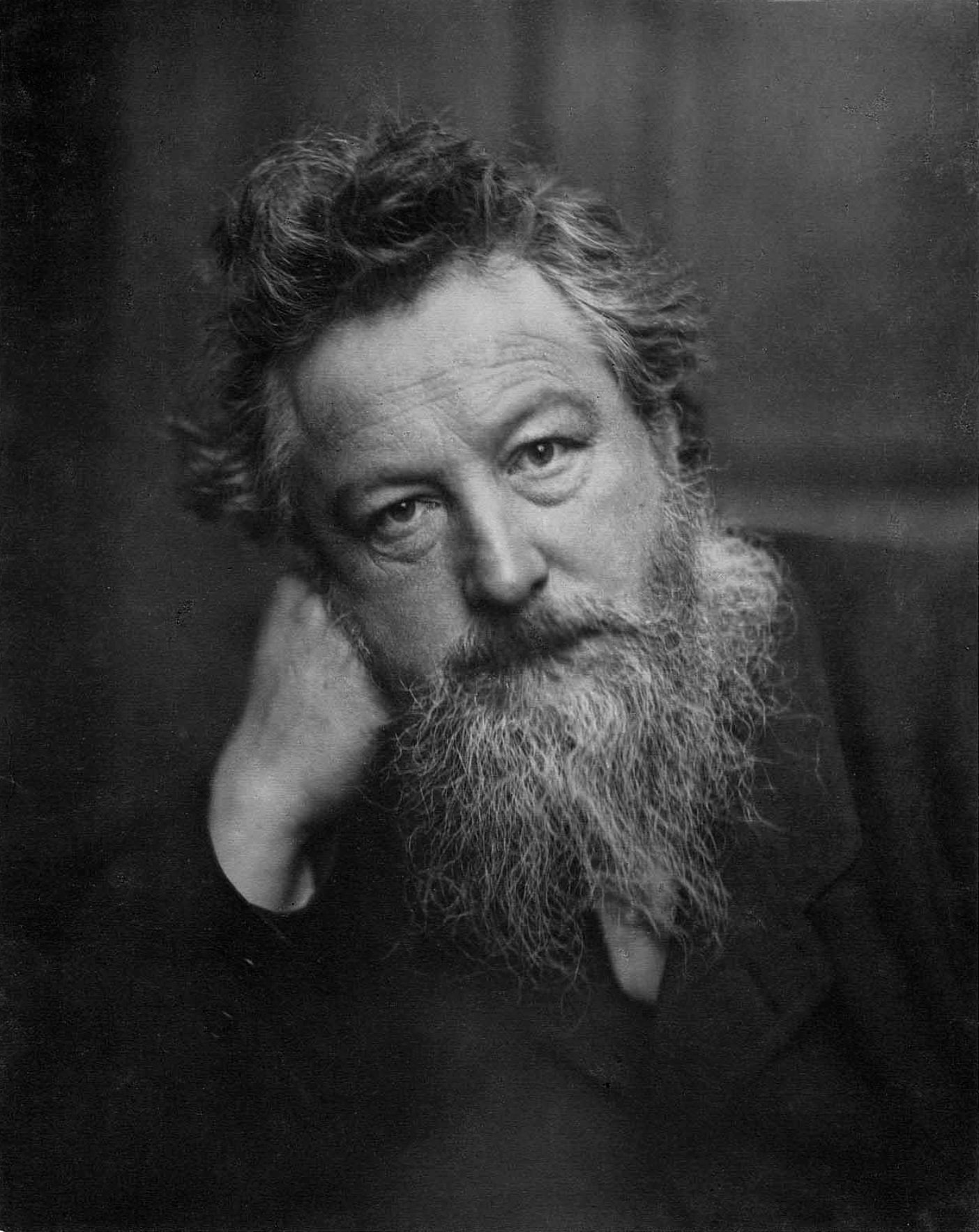
WILLIAM MORRIS

Today I would like to talk about one of my favourite designers since 1450:)

William Morris (24 March 1834 – 3 October 1896) was an English textile designer, artist, writer, and libertarian socialist associated with the Pre-Raphaelite Brotherhood and English Arts and Crafts Movement. He founded a design firm in partnership with the artist Edward Burne-Jones, and the poet and artist Dante Gabriel Rossetti which profoundly influenced the decoration of churches and houses into the early 20th century. As an author, illustrator and medievalist, he helped to establish the modern fantasy genre, and was a direct influence on postwar authors such as J. R. R. Tolkien. He was also a major contributor to reviving traditional textile arts and methods of production, and one of the founders of the Society for the Protection of Ancient Buildings, now a statutory element in the preservation of historic buildings in the UK.


Morris wrote and published poetry, fiction, and translations of ancient and medieval texts throughout his life. His best-known works include The Defence of Guenevere and Other Poems (1858), The Earthly Paradise (1868–1870), A Dream of John Ball (1888), the utopian News from Nowhere (1890), and the fantasy romance The Well at the World's End (1896). He was an important figure in the emergence ofsocialism in Britain, founding the Socialist League in 1884, but breaking with that organization over goals and methods by the end of the decade. He devoted much of the rest of his life to the Kelmscott Press, which he founded in 1891. Kelmscott was devoted to the publishing of limited-edition, illuminated-style print books. The 1896 Kelmscott edition of the Works of Geoffrey Chaucer is considered a masterpiece of book design.


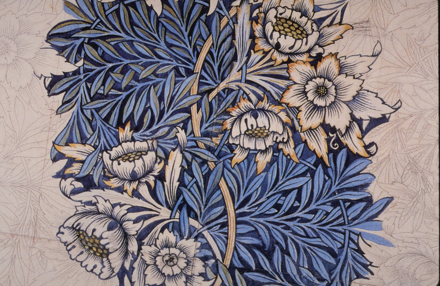
Furnishing textiles were an important offering of the firm in all its incarnations. By 1883, Morris wrote "Almost all the designs we use for surface decoration, wallpapers, textiles, and the like, I design myself. I have had to learn the theory and to some extent the practice of weaving, dyeing and textile printing: all of which I must admit has given me and still gives me a great deal of enjoyment.

Morris's preference for flat use of line and colour and abhorrence of "realistic" three-dimensional shading was marked; in this he followed the propositions of Owen Jones as set out in his 'The Grammar of Ornament' of 1856, a copy of which Morris owned. Writing on tapestry weaving, Morris said:

As in all wall-decoration, the first thing to be considered in the designing of Tapestry is the force, purity, and elegance of the silhouette of the objects represented, and nothing vague or indeterminate is admissible. But special excellences can be expected from it. Depth of tone, richness of colour, and exquisite gradation of tints are easily to be obtained in Tapestry; and it also demands that crispness and abundance of beautiful detail which was the especial characteristic of fully developed MediƦval Art. - Of the Revival of Design and Handicraft


It is likely that much of Morris's preference for medieval textiles was formed — or crystallised — during his brief apprenticeship with G. E. Street. Street had co-written a book on Ecclesiastical Embroideryin 1848, and was a staunch advocate of abandoning faddish woolen work on canvas in favour of more expressive embroidery techniques based on Opus Anglicanum, a surface embroidery technique popular in medieval England

He was also fond of hand knotted Persian carpets and advised the South Kensington Museum in the acquisition of fine Kerman carpets


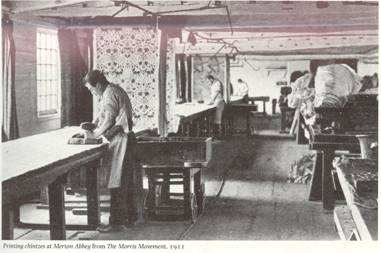
Morris' first repeating pattern for wallpaper is dated 1862, but was not manufactured until 1864. All his wallpaper designs were manufactured for him by Jeffrey & Co, a commercial wallpaper maker. In 1868 he designed his first pattern specifically for fabric printing. As in so many other areas that interested him, Morris chose to work with the ancient technique of hand woodblock printing in preference to theroller printing which had almost completely replaced it for commercial uses.

Morris took up the practical art of dyeing as a necessary adjunct of his manufacturing business. He spent much of his time at Staffordshire dye works mastering the processes of that art and making experiments in the revival of old or discovery of new methods. One result of these experiments was to reinstate indigo dyeing as a practical industry and generally to renew the use of those vegetable dyes, such as the red derived from madder, which had been driven almost out of use by the anilines. Dyeing of wools, silks, and cottons was the necessary preliminary to what he had much at heart, the production of woven and printed fabrics of the highest excellence; and the period of incessant work at the dye-vat (1875–76) was followed by a period during which he was absorbed in the production of textiles (1877–78), and more especially in the revival of carpet-weaving as a fine art. However, his first carpet designs of 1875, were made for him industrially by commercial firms using machinery.

Morris's patterns for woven textiles, some of which were also machine made under ordinary commercial conditions, included intricate double-woven furnishing fabrics in which two sets of warps and wefts are interlinked to create complex gradations of colour and texture. His textile designs are still popular today, sometimes recoloured for modern sensibilities, but also in the original and bright colourways.


In January 1891, William Morris and William Bowden founded the Kelmscott Press at Hammersmith, London, named for Morris’s eponymous manor house in Cotswolds. The Kelmscott Press was founded to refashion Victorian typography and to create beautiful books based on medieval manuscripts. William Morris’s preoccupation with printing, bookmaking and romance writing contradicted with his political radicalism. Morris was also a member of the Socialist League and the editor of the Commonweal. William Morris and the Arts and Crafts Movement had an idealized vision of British medieval times including illustrated books, and a feudal system where if a nobleman owned land, they had to consider the poorer families living on his land—so the creation of the Kelmscott Press by William Morris are a union with his ideas of British medieval life and Socialism. The press was founded in order to produce books by traditional methods, using, as far as possible, the printing technology and typographical style of the fifteenth century. In this he was reflecting the tenets of the Arts and Crafts movement, and responding to the mechanisation and mass-production of contemporary book-production methods and to the rise of lithography, particularly those lithographic prints designed to look like woodcuts.

Morris oversaw many of the aspects of the Kelmscott Press, which was a collaborative effort involving printers, engravers, editors, illustrators, craftsmen and businessmen. He designed two typefacesbased on fifteenth-century models, the Roman "Golden" type (inspired by the type of the early Venetian printer Nicolaus Jenson) and the black letter "Troy" type; a third type, the "Chaucer" was a smaller version of the Troy type. He also designed floriated borders and initials for the books, drawing inspiration from incunabula and their woodcut illustrations. Selection of paper and ink, and concerns for the overall integration of type and decorations on the page, made the Kelmscott Press the most famous of the private presses of the Arts and Crafts movement, and the main inspiration for what became known as the "Private Press Movement". It operated until 1898, producing more than 18,000 copies of 53 different works, comprising 66 volumes, and inspired numerous other private presses, notably the Vale Press, Caradoc Press, Ashendene Press and Doves Press.


What I like about William's work?
 I think he's an original artist, and its hard to copy exactly the same work as he has done. 
His pieces are extraordinary and have something unique inside. Beautiful colours, amazing texture and shapes, pretty much everything what we could ask for back in late 450's